Well, drawing a circle with pure CSS is easy.
.circle {
    width: 100px;
    height: 100px;
    border-radius: 100px;
    border: 3px solid black;
    background-color: green;
}
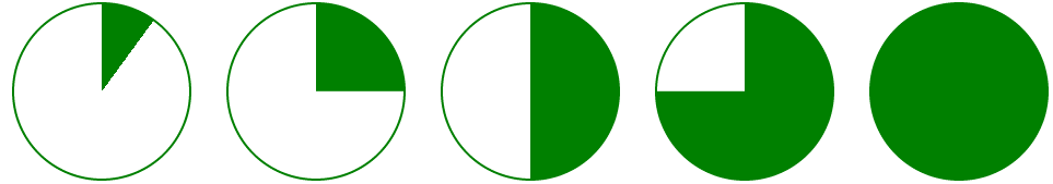
How do I draw a sector? Given a degree X [0-360] I want to draw a X degrees sector. Can I do that with pure CSS?
For example:
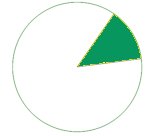
Thanks + Example
Thank you Jonathan, I used the first method. If it helps someone here's an example of a JQuery function that gets percentage and draw a sector. The sector is behind the percentage circle and this example shows how to achieve an arc around a circle from a start degree.
$(function drawSector() {
  var activeBorder = $("#activeBorder");
  var prec = activeBorder.children().children().text();
  if (prec > 100)
    prec = 100;
  var deg = prec * 3.6;
  if (deg <= 180) {
    activeBorder.css('background-image', 'linear-gradient(' + (90 + deg) + 'deg, transparent 50%, #A2ECFB 50%),linear-gradient(90deg, #A2ECFB 50%, transparent 50%)');
  } else {
    activeBorder.css('background-image', 'linear-gradient(' + (deg - 90) + 'deg, transparent 50%, #39B4CC 50%),linear-gradient(90deg, #A2ECFB 50%, transparent 50%)');
  }

  var startDeg = $("#startDeg").attr("class");
  activeBorder.css('transform', 'rotate(' + startDeg + 'deg)');
  $("#circle").css('transform', 'rotate(' + (-startDeg) + 'deg)');
});
.container {
width: 110px;
height: 110px;
margin: 100px auto;
}
.prec {
top: 30px;
position: relative;
font-size: 30px;
}
.prec:after {
content: '%';
}
.circle {
position: relative;
top: 5px;
left: 5px;
text-align: center;
width: 100px;
height: 100px;
border-radius: 100%;
background-color: #E6F4F7;
}
.active-border {
position: relative;
text-align: center;
width: 110px;
height: 110px;
border-radius: 100%;
background-color: #39B4CC;
background-image: linear-gradient(91deg, transparent 50%, #A2ECFB 50%), linear-gradient(90deg, #A2ECFB 50%, transparent 50%);
}<script src="https://ajax.googleapis.com/ajax/libs/jquery/1.10.1/jquery.min.js"></script>
<div class="container">
<div id="activeBorder" class="active-border">
<div id="circle" class="circle">
<span class="prec">66</span>
<span id="startDeg" class="90"></span>
</div>
</div>
</div>$(function drawSector() {
// Get degrees
...
// Draw a sector
if (deg <= 180) {
activeBorder.css('background-image', 'linear-gradient(' + (90+deg) + 'deg, transparent 50%, #A2ECFB 50%), linear-gradient(90deg, #A2ECFB 50%, transparent 50%)');
}
else {
activeBorder.css('background-image', 'linear-gradient(' + (deg-90) + 'deg, transparent 50%, #39B4CC 50%), linear-gradient(90deg, #A2ECFB 50%, transparent 50%)');
}
// Rotate to meet the start degree
activeBorder.css('transform','rotate(' + startDeg + 'deg)');
});


